Google Wear OS mandates black is the new black, continues tech’s obsession with boring minimalism
As of August 2023, Wear OS apps can use any background colour they want – as long as it’s black
The blinking cursors and text prompts of early computers were old hat overnight thanks to the Mac, which popularised a desktop metaphor that echoed the real world. But abstraction remained. Low-res displays and mouse-based input meant there was no chance of mistaking on-screen graphics for the real world and repeatedly trying to grab a document, until your Mac showed the hitherto unknown FURIOUS MAC icon and shut down until you behaved yourself.
Desktop visuals improved over the years, but the advent of the iPhone was what fully upended interface design. A multitouch interface was a novel concept. The entire device became the app you launched, and Apple heavily pushed the notion interactions should be optimised for the task at hand. The company’s designers therefore drew heavily from the real world, to make this new system feel familiar rather than alien.
We entered a world of overt skeuomorphism – of lifelike objects and high-res mimicry. Apps begged for direct, tactile interaction. There was leather and stitching in Calendar. Lined paper in Notes. Shelves. Buttons. Switches that looked like you could interact with them, just like the physical ones on the device itself. The iPhone – and, later, the iPad – was a playground for design. Until it wasn’t.
Black mark
With iOS 7, Jony Ive decreed that the minimalism he imbued into Apple hardware should also apply to software. Google soon followed suit with Material Design. And so began an interface design era of boring consistency, leaving less space for fun and creativity. The logical end point recently arrived in Wear OS policy changes, which don’t so much recommend black app backgrounds as mandate them. Disobey and your Android smartwatch app may be consigned to the search results void of doom.
But why? Does Google hate fun? Have the company’s execs embraced the Dark Side or become goths? Did Google’s designers take the phrase ‘black is the new black’ too literally? Alas, the reasons are far more prosaic. According to Google, its latest changes are “designed to help […] provide a consistent, intuitive and enjoyable experience for Wear OS users”, and to “improve the quality of apps for Wear OS and their presentation in the Google Play Store”.
In short, it’s about making the platform look tighter and more polished. Black backgrounds make screen bezels (still chunky on Wear OS devices) disappear, and give apps the opportunity, when appropriate, to push content to the very edge of screens, minimising padding on devices that have little space to spare as it is. It also likely helps with battery life.
Paint it black
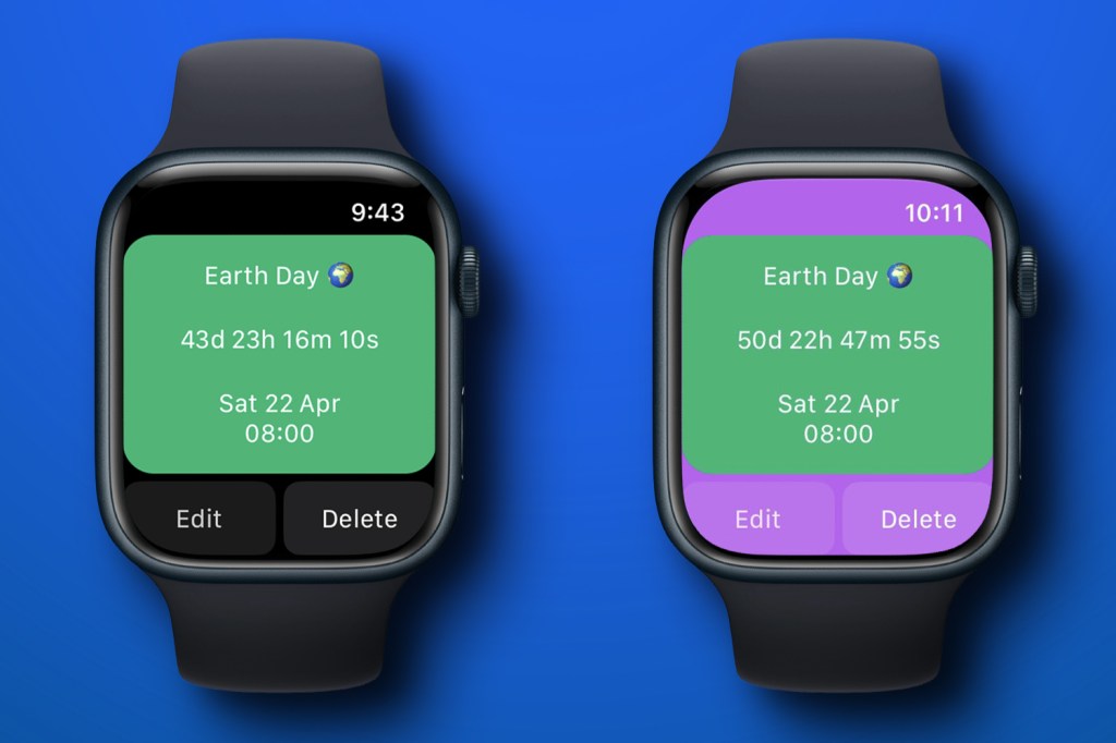
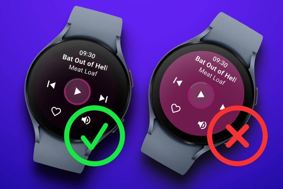
It also turns out Google is following Apple’s lead. When I asked developers about similar rules for watchOS, they said black is not enforced, but Apple has made it extremely clear that black backgrounds are the way to go. (And as developers know, they ignore Apple at their peril.) Plus, as app maker Ben Brewis demonstrates in the image above, should a developer choose to, in his words, “go rogue and set a colour for the background view,” the results aren’t going to win a pile of Apple Design Awards. Even if you like purple.
Google’s Wear OS rules rubbed me up the wrong way when I first read them. It felt like doubling down on boring homogeneity on a platform that could do with standing out. I mulled that Dynamic Island showed it’s possible to embrace hardware rather than hide perceived flaws. But then a phone’s relative screen acres are very different from the comparative claustrophobia of a watch.
So ‘dull but effective’ wins. Honestly, that’s the case elsewhere for me as well. Even on iPad, I gravitate towards apps that leverage Apple’s core design language – for example, RSS client NetNewsWire over its more idiosyncratic rivals. So Google’s probably right about those black backgrounds – as is Apple. But part of me can’t help but wistfully look back on a time when mobile apps were an explosion of creativity rather than having barely more room to move than a designer crammed into a smartwatch case.
 Craig Grannell
Contributor
Craig Grannell
Contributor