Android 16 is the big Android update I’ve been waiting for
Google unveils Android 16, with a bolder and more connected interface – and suddenly, I'm excited about Android updates again
I’ll admit it: I’ve been getting quietly frustrated with Android’s look and feel recently. Not because it’s bad – it’s actually been fine – functional, clean, polished, and powering some of the best premium and mid-range phones around, but recently it’s felt increasingly… boring. Now Google has shown off Android 16, with a bolder, smarter, more emotionally connected interface – and suddenly, I’m excited about Android updates again.
I haven’t used Android 16 yet – but I’ve seen it in action. This is the update I’ve been waiting for. Not because it’s packed with new features (though it is), but because it finally feels like Google has nailed the bit that matters most: making Android feel alive again.
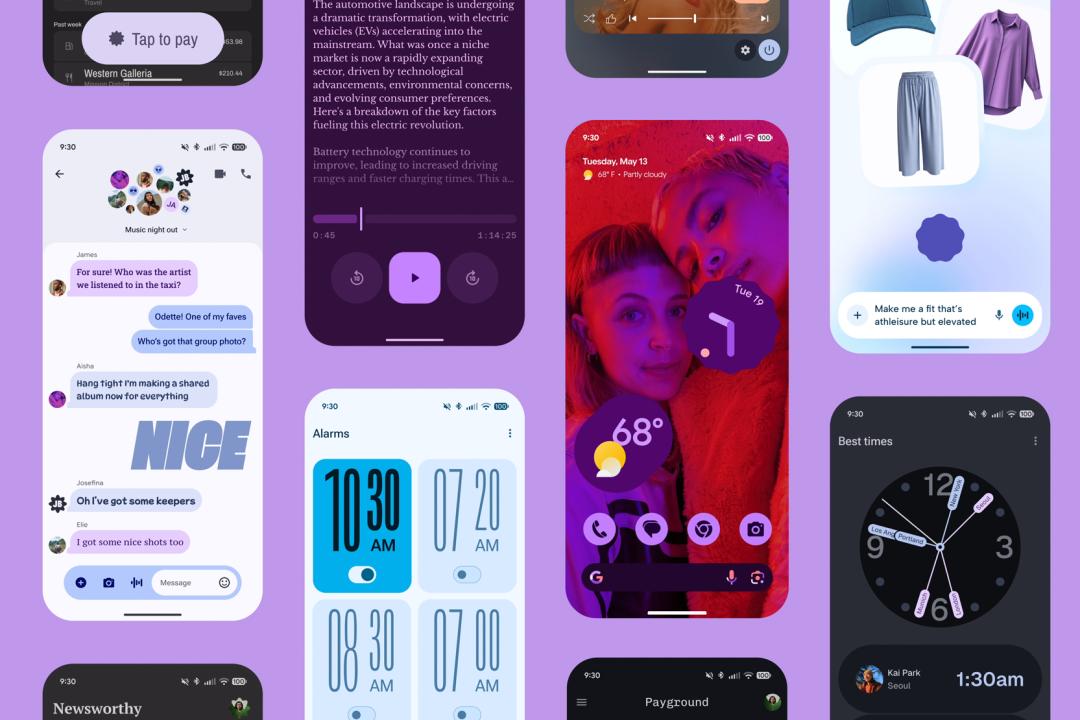
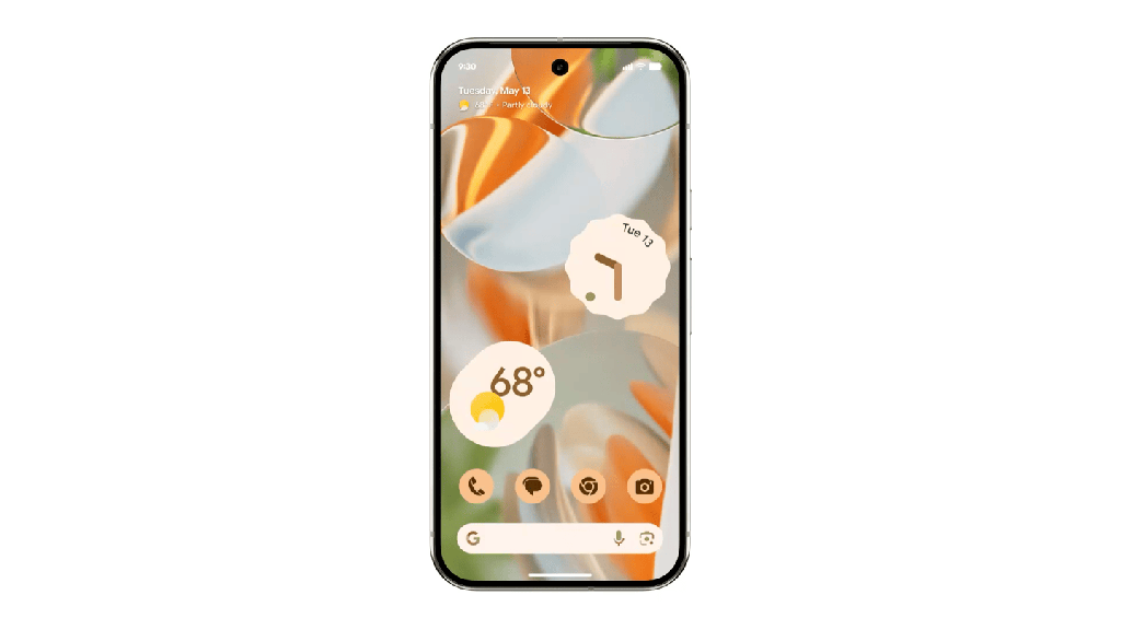
Material You was introduced all the way back in 2021, and it brought a much-needed splash of colour and consistency. But Material 3 Expressive, the new design language powering Android 16 and Wear OS 6, makes it feel personal in a way I haven’t seen since… maybe ever. It doesn’t just look better – it moves and feels better.
Take something as boring as dismissing a notification. With Material 3 Expressive, it’s suddenly satisfying. The notification doesn’t just vanish – it springs away with a subtle bounce, the rest shift naturally to fill the space, and you get this tiny haptic nudge that tells your fingers: “Yes, that worked.” It’s a small touch, but when the whole OS is full of these moments, your phone starts to feel less like a grid of apps and more like a responsive companion.
It’s the same story across the UI. The volume slider glides. The Quick Settings menu now blurs the background slightly, which sounds like fluff, but in practice, it helps you focus without losing your place. Even the recent apps view – usually a wasteland of half-frozen screens – feels more dynamic.
Then there’s the Live Updates feature. This one might actually change how I use my phone. Order an Uber Eats, and the update sits there, glanceable and live, no digging through notifications. It’s neat, it’s useful, and it’s the kind of design decision that respects your attention instead of fighting for it.
And the visual polish runs deep. The new typography feels easier on the eyes. Colour theming is smarter and it’s making its way into Google’s own apps too. Gmail, Photos, Fitbit, you name it.
But the real surprise? Wear OS. Android 16’s design spills over onto your wrist, and it it might persuade me to pick up a smartwatch again. The animations curve with the round display. Buttons hug the edges. Tiles finally feel like they were meant for the space, not just shrunk-down phone widgets. Even the humble pin pad looks improved.
And yes – the colour theming from your watch face now applies system-wide. It’s the kind of attention to detail that makes the whole OS feel more unified.
Android 16 isn’t out yet – it’ll land on Pixel devices later this year (including the excellent Pixel 9 Pro and Pixel 9a) and roll out to more devices after. But from what I’ve seen so far, it’s not just another yearly polish, it’s a shift in tone, and for the first time in a while, I’m actually excited to update.
Liked this? I spent an hour with the Samsung Galaxy S25 Edge – here’s my verdict on the new super-thin model
 Spencer Hart
Buying Guide Editor
Spencer Hart
Buying Guide Editor