5 ways we’d improve OS X Yosemite before the big launch
The beta release of Apple's new desktop OS is great - but not quite perfect. Here's how we'd make it better still
It’s time we did Apple a favour.
As you might have heard, the tech giant broke its own rules last week by previewing its new desktop OS, OS X 10.10 Yosemite, via a beta program. That’s a first for Apple, although you needed to act fast to get the update – only the first million applicants got access.
Well, seeing as beta releases are all about getting feedback from users, we’ve come up with a list of improvements that we’d make if we had the chance.
Because as brilliant as we think Yosemite is – and you can find out exactly what we think of it in our full Mac OS X Yosemite beta hands-on review – we can’t help but want it to be perfect.
So, after much discussion, here are the little fixes that we’d love Apple to make to the new software before its release…
READ MORE: Everything you need to know about the Apple iPhone 6
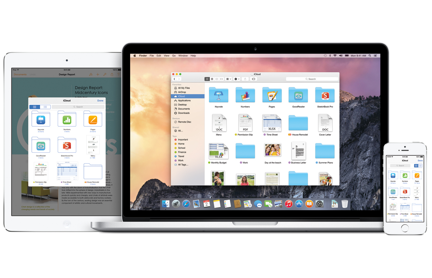
1. If you’re going to change Spotlight, go the whole hog
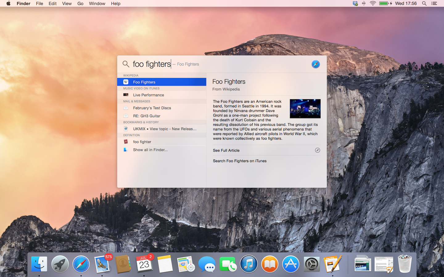
Yes, yes, we know, Apple – the new Spotlight interface bears a passing resemblance to Alfred (that smart little independent launcher app that does a ton of other stuff). And you can preview files from within the new Spotlight window, which is just lovely.
But why can’t we grow the new Spotlight window? It just sits there; take your mouse to a corner, and there’s no option to drag it wider or deeper. Which means that you’re left to squint at the previews in that window, wondering what everything says.
And while you’re sorting that out, could you sneak in a saved search feature in Spotlight that could be integrated into the Finder? We’d be ever so grateful.
2. Fill screen good, full screen bad
That little green button. You know – the one to the right of the trio in every Mac application window. Up until now, clicking that green button expanded the window to (almost) fill your screen (leaving the dock and menu bar visible). Now, it switches the application to total full screen.
There’s logic to it, we know (there’s logic to everything Apple does), but it has driven us ever-so-slightly insane. You have to remember to press ‘alt’ before clicking the green blob every time (this switches it back to normal fill-the-screen mode). It’s one of those changes that could drive a million Mac owners to distraction – unless you all spend your lives swiping between full-screen applications on your glassy trackpads… which we somehow doubt.
3. Have a word with the designer who thinks those new folders look good
They’re not as good as the folders in Mavericks 10.9. And no, they’re not growing on us, no matter how long we stare at them (we’ve tried ’em on a low-res Air, and a Retina-equipped Pro… no difference).
If this was your idea, Mr Ive, you do not have the excuse that the folders in Mavericks were particularly skeuomorphic (and we know how much you hate a skeuomorph) – they were flat, clean, and pretty.
The new, even flatter folders actually don’t look like folders on a 2013 MacBook Air screen, at least in the most common Finder views (ie smaller). No, they look like rectangular, powder-blue cards. That’s probably because when you blow ’em up big, that’s what they are – slightly gradated powder-blue cards with a little tab and thin, lighter edge on top.
READ MORE: How to get your Mac ready for OS X Yosemite
4. Don’t go ahead with that font change just yet
The Stuff office is divided. Between those with taste, and those with none. Some of us love it. Some (those with an eye for type, and an appreciation for care and attention) think that it’s bland in a desktop environment, and that hours of work are needed in getting the face to kern properly.
Stick it underneath those powder-blue cards that act as folder icons, and the effect is… well, different. By which we mean that you’ll be too busy being upset about the folders to care about the font.
5. PLEASE get Safari cooking
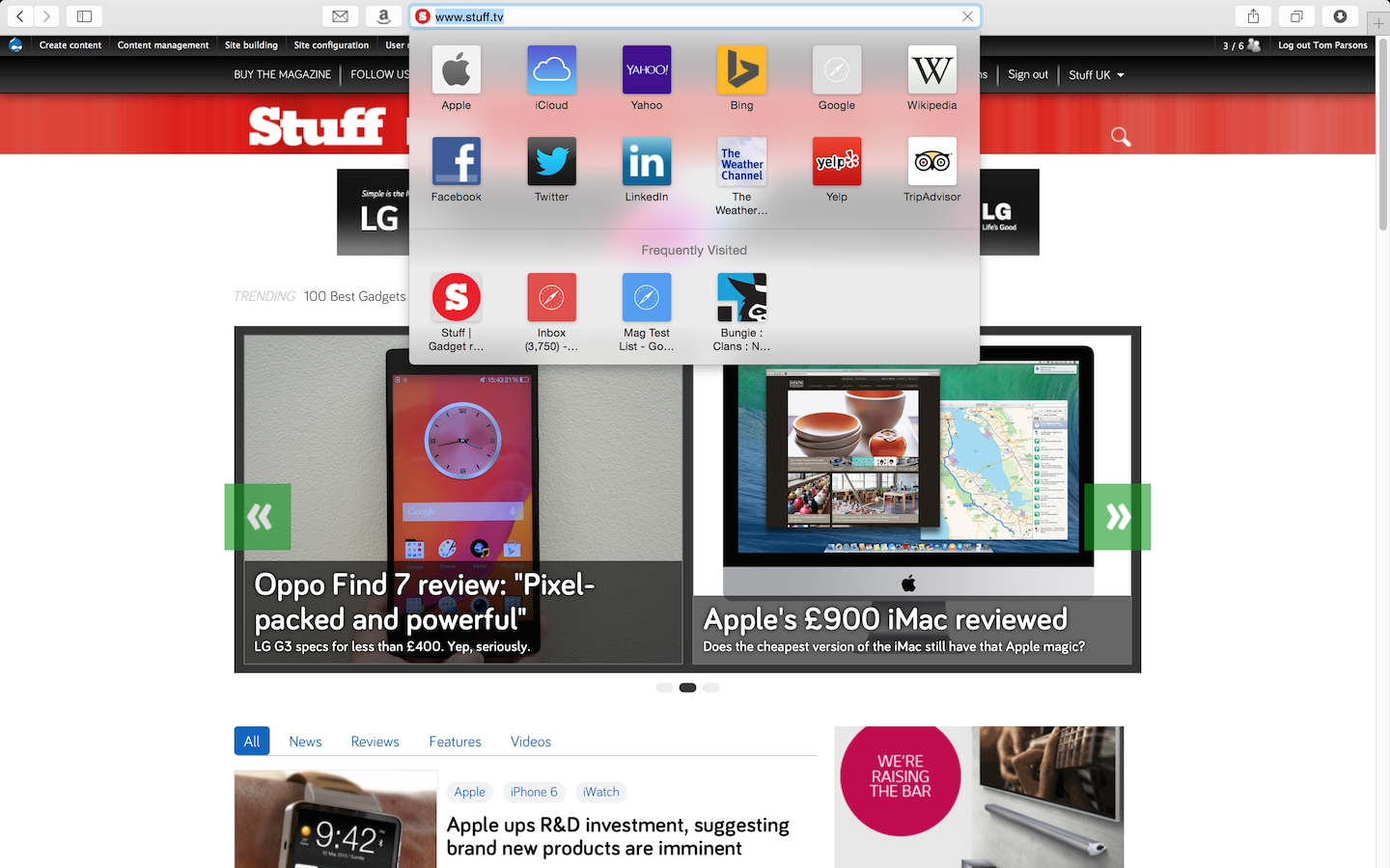
Lots of people use Safari, we know. But loads more use Chrome (ask Microsoft – they feel the pain). Those Chrome users have multiplied for (we think) simple reasons. You can pin tabs, for one. Obvious, we know, but how many people arrive at their desk every morning and boot into a standard set of pages? Loads.
Yes, Safari can open with a standard set of pages – but they eat 90% of the tab bar. So introduce pinned tabs, and look a little less like Internet Explorer (ouch…).
Then there’s extensions. Again, we know they’re built into Safari today. But it doesn’t have many, while Chrome is building an entire ecosystem that turns the humble browser into a multi-tasking monster (and almost the replacement for a desktop).
If the developers won’t play (and right now, they not), give them an incentive: holidays, free Xboxes… anything.
READ MORE: The 15 best Mac games right now
 Mark Payton