Apple Mac OS X El Capitan review
Does Apple's new desktop OS give Windows 10 a run for its money?

Good, bad, good, bad, good: the big desktop and mobile operating systems seem to follow a predictable pattern. Take Windows: Vista was bad, W7 was good, W8 was bad (and, oddly, also good), and now Windows 10 is good (great, in fact).
Apple has never quite matched the rhythm or extremity of Microsoft’s vacillations between good and highly questionable, but that doesn’t mean that Mac OS X hasn’t dropped the odd howler in its 14 year history.
Take Yosemite, the last big OS X update, which has earned a reputation over time as a (minor) balls-up. It wasn’t horrible by any means, but it was far from an Apple high point. Not least, it suffered from a flaw you’d don’t normally associate with Apple products: lag.
The good news is that El Capitan, the latest update, claims to fix Yosemite’s responsiveness, while ushering in a clever new arsenal of features designed to see off a re-energised Windows.
Thing is, you might struggle to spot the differences when you upgrade to El Capitan. You’ll see some changes, yes, but they’re not the night-and-day transformation of Windows 8 to Windows 10. So is El Capitan’s hefty download and lengthy upgrade process was worth your precious time?
The answer, since we know that you’re impatient, is an unequivocal yes. And here, in case you’re wondering, is why…
PERFORMANCE: YOU WON’T NEED TO SCREAM IF YOU WANT TO GO FASTER
El Capitan is quick. There, we said it. Now move on.
Actually, before you go, let’s just repeat that again: El Capitan 10.11 has none of the stutters that haunted OS X Yosemite 10.10.
Yosemite seemed to struggle with animations. Click on, say, the Safari icon to maximise a window, and it would react with the kind of stiff reluctance that would be painfully familiar to Samsung TouchWiz users (before the arrival of the Galaxy S6, of course).
You could make Yosemite faster, but it required a hack. Specifically, you had to go into Accessibility in System Preferences and disable Transparency, the effect introduced with 10.10 Yosemite, and the cause of the slowdowns.
The fact that the irritating stutters were cured by clicking a single (rather hidden) box confirmed everyone’s suspicions: Yosemite simply wasn’t optimised for the fairly intensive gymnastics it was being asked to perform.
El Capitan, you’ll be delighted to hear, is fast. It’s stupidly responsive on my 2015 Macbook Pro Retina 13in, even with the display set to the highest resolution (2560×1600). You could stare at the screen, watching for the slightest drop in frame rate as you flick applications around, but you’d be wasting your time.
If you’re interested, this performance transformation is down to the inclusion in El Capitan of Metal, Apple’s graphics technology that first launched with iOS 8 in 2014. It reduces the CPU load by up to 50%, giving graphics-intensive apps more room to do their thing.
And even if you own older Mac hardware, El Capitan could be good news. I’ve used its release as an excuse to wipe my household’s used-and-abused 2012 Macbook Pro 13in, clean installing the final GM release of 10.11.
The result? A battered old laptop is reborn.
It huffed and puffed under Yosemite’s reign, with regular freezes and beach balls (to the point where I thought that the well-worn spinning hard drive was dying). But boot it into 10.11, and it’s perfectly useable. Snappy, even. Some of that will be down to a clean install, no doubt – but the leap is such that I’m convinced that El Capitan is playing a major role.
If you really want to nerd out, here’s Apple’s guide to Metal (and note that if you own a Mac from before 2012, you’re out of luck).
LOOK AND FEEL: THAT’S BETTER, APPLE
Yosemite was one hell of a leap for Apple back in October of 2014. It introduced a whole new world of colours, transparencies and transitions to the Mac desktop, in line with Jonny Ive’s mission to modernise the Mac and iOS interfaces.
And the design change worked. Kind of. You could see what what the Apple team was trying to achieve – a light, clean, fresh environment where the content came first, not the heavy application furniture surrounding it.
But somehow, the new desktop didn’t gel. In particular, there was something subtly wrong about Yosemite’s choice of system font. Apple bravely ended its long-standing affair with the Lucida Grande in favour of Helvetica Neue. Which could have been great, but for the fact that Neue bluntly refused to look good at certain sizes (the harsher critics out there would say all sizes).
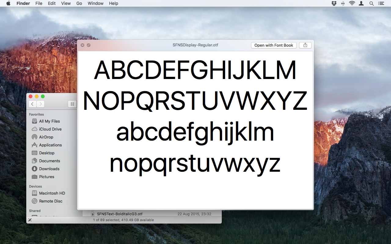
If you’re one of the many who found Yosemite jarring, you’ll instantly fall in love El Capitan. Helvetica Neue’s gone, replaced by the font that made its debut with the Apple Watch – San Francisco.
This new font has Lucida Grande readability at all sizes, whilst looking more modern than Lucida and Neue. The end result the prettiest desktop OS in the world, ever. It’s so good that you should immediately splash £1,200 on a Retina Macbook Pro, just so you can admire Capitan in all of its pixel-polished, perfectly kerned glory.
And if you think we’re being facetious, you’re wrong. Windows 10 may be a major jump in the right direction for Microsoft interfaces, but alongside El Capitan, it looks ever-so-slightly bland and overly corporate. Given Microsoft’s heritage and current self-set brief, this could be intentional.
Mighty Microsoft › Windows 10 review
USABILITY: WHERE DO WE GO FROM HERE?
El Capitan brings very few new tricks to the OS X desktop, and there’s a reason for that – there aren’t that many new tricks out there. Or at least, not without going down the touch road (at which point, OS X logically hands over to iOS).
If you were willing to overlook its hiccoughs, Yosemite was delightfully easy to use and more powerful than any normal user would ever need. El Capitan not only carries on that tradition, but improves on Yosemite with a host of refinements.
Want to find a file or a fact? Spotlight can now do both, and at an awesome speed. Want to work quickly with multiple apps? The improvements to Mission Control, including the split-screen feature originally pioneered by Windows 8, make this easier than ever. Need to get some serious work done? The upgrades to the built-in Mail and Calendar apps will save you time.
If this reads like some Apple promo, apologies. But it’s difficult to strike that detached tone of objectivity when faced with a system that’s so damned good.
Yes, there’s still room to improve functionality now that the Force Touch trackpad is built into the 12in Macbook and new Macbook Pros, but that will come as developers get to work on El Capitan’s new APIs.
And yes, you could improve Mail, Calendar and Reminders even further, so giving Apple more creds with the business crowd and productivity nerds. But then, there’s an ocean full of great third party Mac apps to take care of that job.
Using El Capitan day on day, you wonder what could be added to improve it, a thought that I’ll safely bet is weighing on the minds of Apple’s desktop design team.
SAFARI: PINNED TABS… AT LONG, LONG LAST
I live in browsers. Chrome, Firefox, Safari, even Opera. I do it for my job, and I do it because I’m a sucker for software. And there’s one thing in the wide world of browsers that I’ve never understood – why Safari doesn’t support tab pinning.
For any self-respecting Mac user, that single omission has meant a world of pain in recent years. Unable to live with Safari, you’ve resorted to Chrome. Which is a great browser, don’t get me wrong, especially in the way it supports a library of extensions that you could keep you busy forever.
But Chrome on a Mac is a bad marriage. For reasons best known to the Google development team, Chrome in Mac guise has been a resource hog, sending your CPU through the roof at a moment’s notice.
Leave it long enough, and it would slow your machine to a crawl. Or at least it did, until recent Canary development builds of Chrome took a dramatic turn for the better, massively reducing the Mac version’s resource hunger.
Why did Google make the change? Because they’d seen the development version of El Capitan’s Safari. Yes, it has tabs. And they can be pinned. Praise the Lord, and pass the butter. Rightly, Google team’s presumably envisaged a mass exodus of users from Chrome – and lo and behold, in my case at least, that’s precisely what has happened.
Safari in El Capitan is now millimetres from perfect. It launches almost instantly, it looks like part of the OS, it loads web pages at a wicked pace, it’s sharing extension facility is damned handy… and it now lets you pin as many tabs as you like.
All that needs to happen now is a revolution in the Safari extensions ‘store’. Here, Google still beats its Apple rival hands down, with extensions available in the Chrome Web Store for virtually every available job. It’s obvious that Apple has plans to rejuvenate the library of third party extensions, but as of today, it still needs a lot of work.
If you’re happy to live with that one shortcoming, Safari is now the best Mac browser. Now there’s a sentence I never thought I’d type.
12in titan › Macbook 2015 review
APPLE NOTES: EVERNOTE, WE’RE COMING FOR YOU…
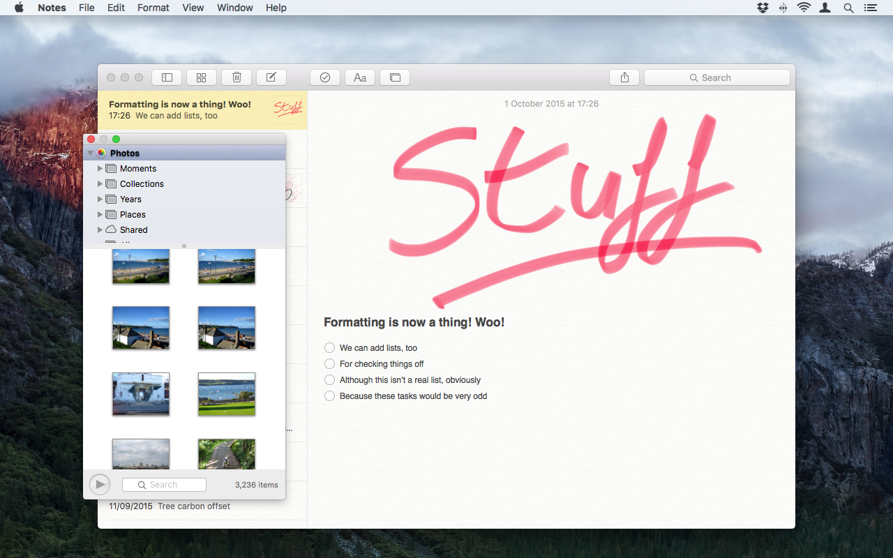
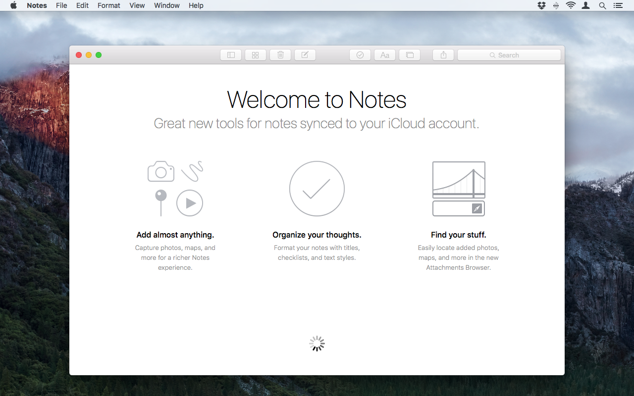
As our iOS 9 review so eloquently pointed out, Notes has always been the sad loner in the Apple suite of apps. For reasons that we’ll never understand, Apple left its note-taking app in the cupboard for years, gathering dust while immeasurably more capable competitors grew massive audiences.
El Capitan has a bloody good go at fixing that. The actual note document will now handle written or drawn input, and you can import a whole range of document types, from Word to PowerPoint to PDFs.
In fact, the new Notes a pleasure to use: as simple as you’d expect from Apple (OK, let’s overlook the new Apple Music interface for a moment…), but with enough grunt added to make an Evernote user think twice.
It’s perhaps the relationship with the similarly upgraded Notes app in iOS 9 that will seal the deal for many. I’ve found myself using the Notes Sharing extension in El Capitan and iOS 9 more than ever, saving bookmarks and map directions in seconds, then retrieving them instantly on either platform.
There’s more to do to make Notes truly great, of course.
Evernote has more sorting options for the notes and docs you throw into it. You can tag Evernote notes, which you can’t do with the upgraded Apple Notes. And Evernote has reminders, which I use every day. But if you’re not quite as industrial as me (some would say retentive…), the newly-spruced Apple Notes will more than do the job.
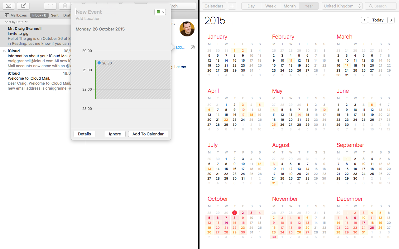
APPLE MAIL AND CALENDAR: THE FIRST STEPS TOWARD SMART
It’s Google that has made the biggest strides in recent years in personalising organisation and communication: witness Google Now, and the way it works with your calendar events, email and browsing history.
Apple, on the other hand, has been punting a fairly everyday email service, and a calendar that synced with the cloud. Not exactly cutting edge.
But with El Capitan (and its sister iOS 9 apps), there are signs that Apple knows that everything should connect.
For example, Apple Mail on the desktop will now scan your email for events, and prompt you to add them to your calendar. When it spots a name or address that you don’t have in your Contacts, it prompts you to add them. It may not be the psychic invisible PA that Google is trying to create, but you’ll use both new features every day.
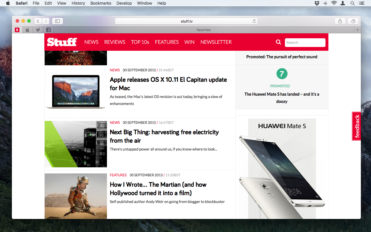
Release day › Apple releases OS X 10.11 El Capitan update for Mac
SPOTLIGHT: LIKE IT WAS, ONLY CLEVER(ER)
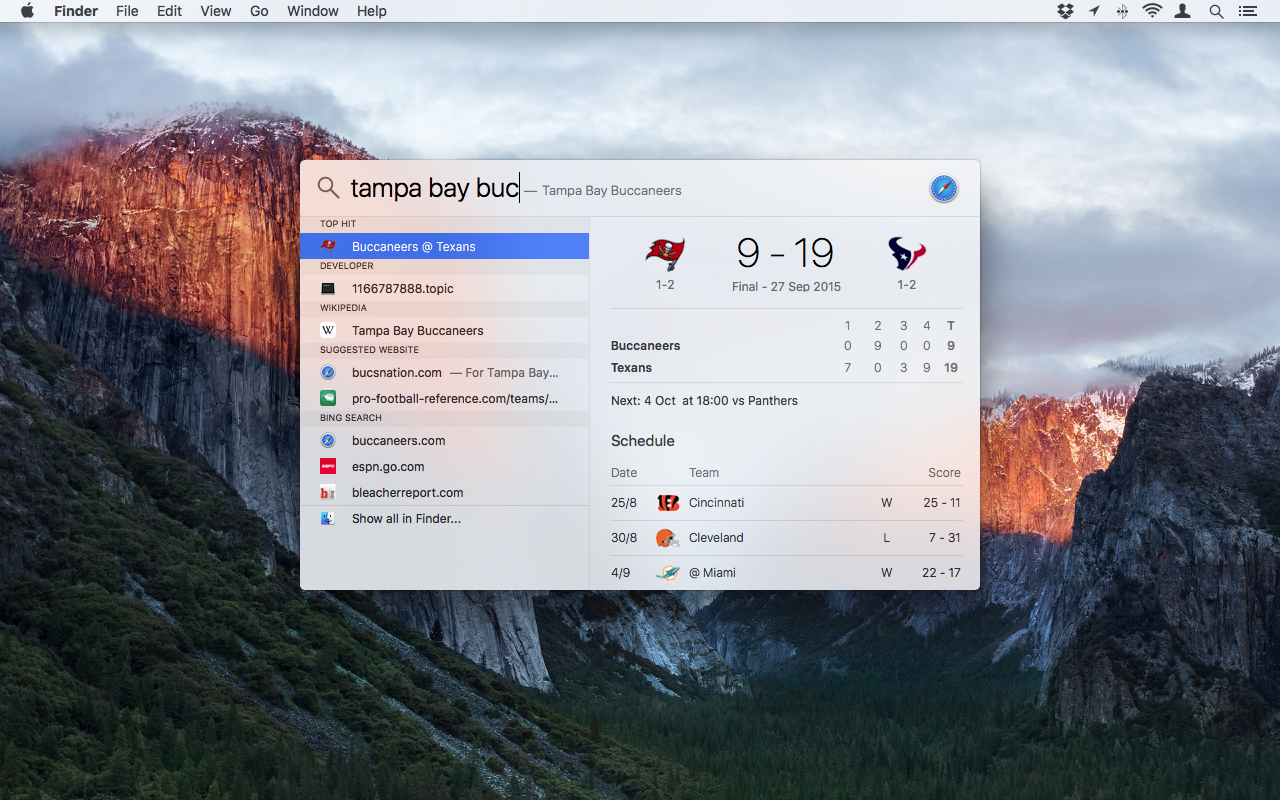
Spotlight and Siri received some serious attention in the upgrade to iOS 9, to the point where the lines are blurred between voice-activated and typed search. The end result is a more flexible, smarter assistant that’s more likely to find what you want, when you need it, where you need it.
Spotlight in El Capitan doesn’t make quite the same leap, but it’s definitely improved.
You can now run natural language searches and get good results. For example, I’m a Green Bay Packers fan (odd for a Brit, I know). Type the team’s name, and Spotlight returns the latest score in the right hand pane. Type ‘weather, London’, and you get the five day forecast.
It will also sift through email, photos and documents using plain English.
So ‘Photos in June’ returns (er…) photos taken in June. ‘Emails from George Washington’ returns all of your correspondence with the famous US leader, and so on. The Spotlight technology isn’t limited to the actual Spotlight search window – the same human searches work just as well within Apple’s native apps, be it Mail, Photos, Calendar or Maps.
The only niggle comes in Apple’s decisions regarding presentation: the Spotlight window insists on returning a Top Hit first. Logical, yes, but, it isn’t always the actual return you were looking for. The other (small) niggle is that while Apple has added the ability to extend the Spotlight window vertically, you still can’t stretch it horizontally. Not a deal breaker, but still a quirk that the system could do without.
THE CURSOR GOES BIG
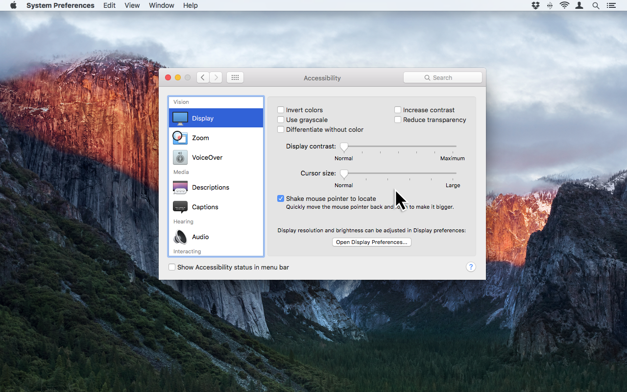
Another sentence I never thought I’d write. Yes, ladies and gentlemen, El Capitan has banished forever the curse of the lost cursor.
Can’t see where your cursor is on the screen (and let’s be honest, we’ve all been there)? Just wiggle your mouse or your finger on your trackpad, and hey presto – the cursor suddenly gets huge, making it almost impossible to miss. Stop wiggling, and it returns to its normal size.
OK, we know – it’s a gimmick, and we’re far too sophisticated for such frippery. Only in the months I’ve been running Capitan, from the early betas to today’s final release, I must have used the gimmick a few dozen times without really thinking. Which, I guess, means that it isn’t a gimmick.
Best of the lot › Macbook Pro 13in 2015 review
SPLIT SCREEN: OH, THE IRONY…
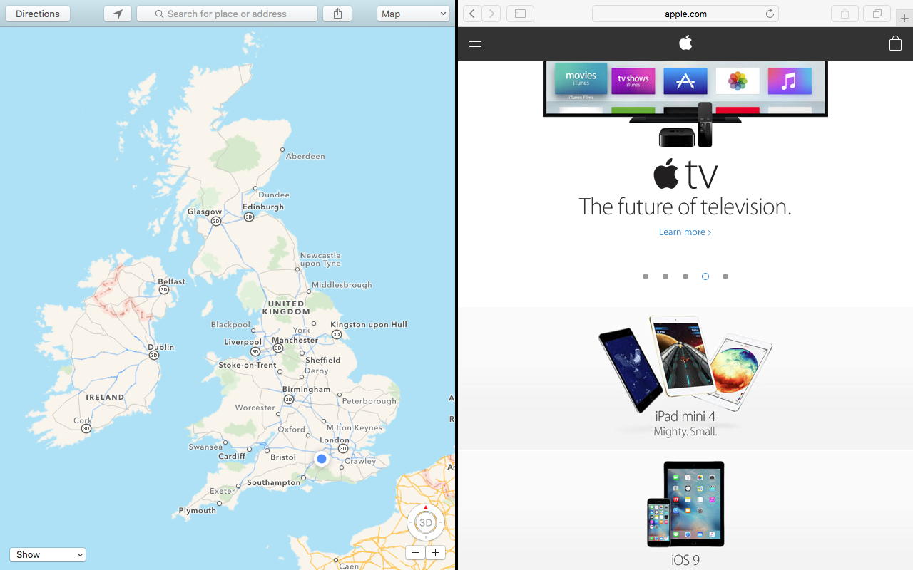
On first acquaintance, El Capitan’s updated Mission Control looks like an exercise in light housekeeping – application windows now sort themselves into tidier piles in Expose view, for example.
But there’s a much bigger addition in 10.11 that we’d forgive many users for never discovering – applications can be used in split screen mode when switched to fullscreen, in an arrangement that will look familiar to Windows 8 users. Oh, the irony.
I say that some users may never discover it, because the process for creating a split screen desktop isn’t immediately obvious. First, you need to switch your application to full screen. Then, you need to go into Mission Control mode, and drag another application on top of the fullscreen app. Lo and behold, the two will sit side-by-side. Go that newly-split desktop, and you’ll find that you alter the ratio of screen space between the two apps.
This sounds like it should be the most useful thing in the world. Look at the potential: you can sit Mail alongside Notes in some kind of productivity Nirvana.
Thing is, I tried it, then never went back again. If I want to quickly switch between apps, I flick up with three fingers on my Macbook‘s trackpad, go into multi-app window view, then tap on the window I want.
That may put me in a club of one (a state of affairs I’m very familiar with), but I can’t see the upside of the new split screen outweighing the speed and ease with which you can work between apps in OS X elsewhere.
El Capitan verdict
Let’s cut to the quick: El Capitan is brilliant, and you should upgrade from Yosemite as fast as your broadband pipe will allow. It’s fast, clever, dashed attractive and will do just about everything you’d ever want to do. Oh, and it’s free.
Is this the greatest desktop OS in the world? Yes. At least, it is if you judge ‘greatest’ is the optimal blend of smart, attractive, flexible and reliable.
For now, anyway, OS X is the way to go.
Powerful and portable › The top 10 laptops in the world right now
Stuff Says…
A welcome improvement on the hit and miss Yosemite.
Good Stuff
Very fast and responsive
Superior usability to Yosemite
Pinned tabs for Safari
Bad Stuff
Split screen functionality isn’t that useful
 Mark Payton