iOS 7 review
Apple's skillfully plundered its rivals to build the most beautiful mobile OS in history [UPDATE: now includes full iOS 7.1 review]
For the past year, Apple’s tablet and phone interface has looked dated, set in its ways and frankly rather unexciting. Recently it’s been Android Jelly Bean and custom skins such as HTC Sense that have been pushing mobile operating systems forward, spearheaded by front-ends that zing with a procession of tweets, news nuggets and social media fodder.
iOS 7 has levelled the playing field. Apple has swallowed some pride and plundered its rivals for their best bits, making sure that no babies were thrown out with the bath water. In fact, the bath water is looking cleaner, clearer and fresher than ever, with a whole bunch of new toys thrown in to keep iPhone and iPad users feeling special.
Is it perfect? No, but it is night-and-day better. Here’s why.
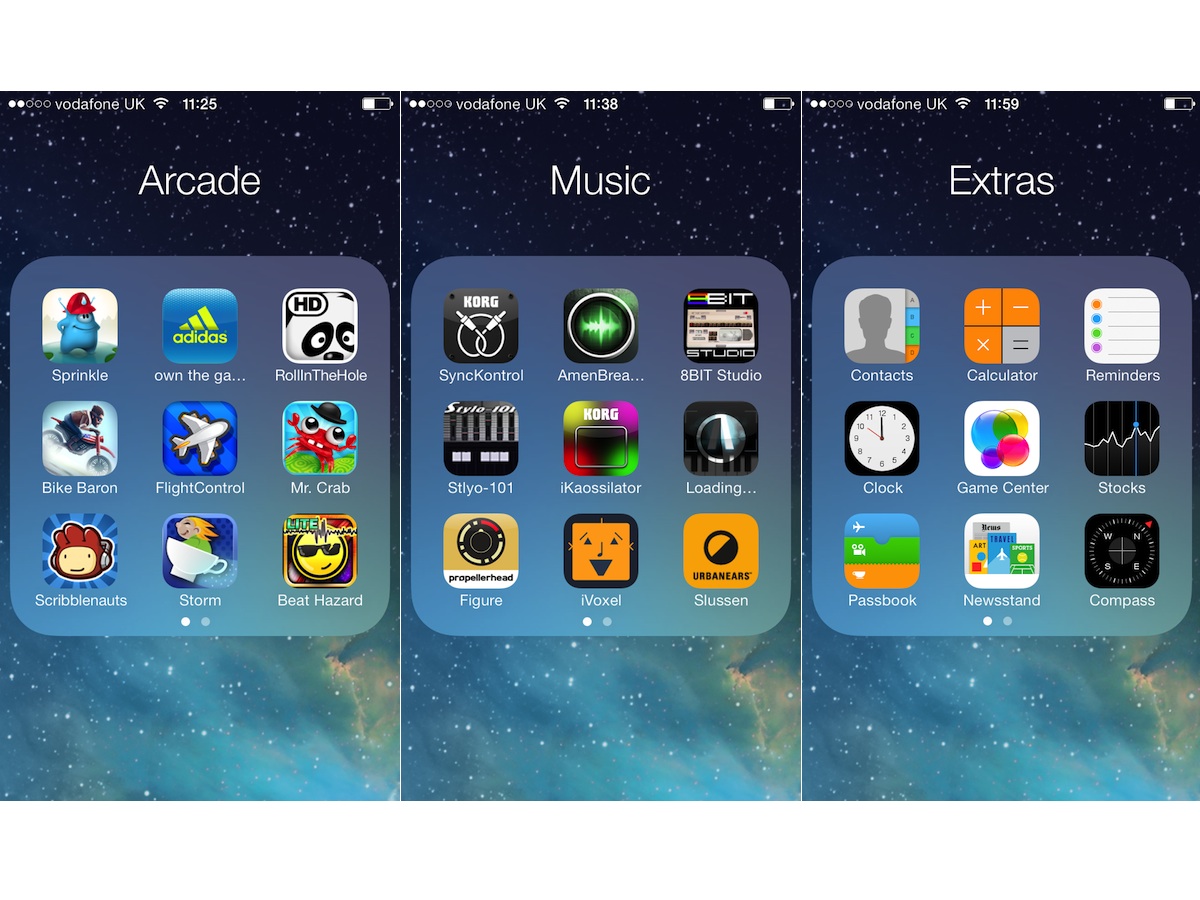
Flying Icons
Fortunately, the garish colour scheme adorning the first beta version of iOS 7 was nothing more than an icky choice of default wallpaper, a few redesigned app icons and a font that was a little too skinny, especially in the absence of drop-shadows.
The final release is a more sober affair, with less of the rainbow stylings, a slick 3D effect that seems to lift the icons above your wallpaper and a slightly bolder system font than the wafer-thin type of the early version. Plenty of the early bugs have been shown the door too. Cue a collective sigh of relief from panicked app developers.
Apple’s stuck with the concept of horizontally scrolling pages of tiled icons, so in terms of basic use there’s nothing crazy to get your head around when you approach iOS 7. One of the first things you’ll notice is the design tweak when opening and closing apps. Now when you select an app, its “splash screen” emanates from the app icon to fill the screen as the icons around it are pushed aside. It’s such a subtle change that you’ll wonder, “Wasn’t it always that way?”.
Similarly, when you close an app with the Home button, the app’s icon zooms back into its place in the grid, and when you unlock your iPhone, the homescreen icons fly into place with a little more panache. It’s not like anyone ever criticised Apple’s transitions, but with ever slicker Android skins and launchers hitting the market, Apple’s upped its game to stay a step ahead.
And iOS 7 deserves some quality getting-to-know-you time as the attention to detail is beyond anything we’ve ever seen on a mobile OS. The animation for downloading apps is a timer wheel revealing more of the icon underneath, almost making you wish iMovie would take longer than 30 seconds to appear. It’ll have designers drowning in drool at the very least. And the first time you hit the Home button from the Camera app, as it blurs the screen and zooms back into place on the homescreen, you’ll immediately open it back up and do it again. At least nine more times.
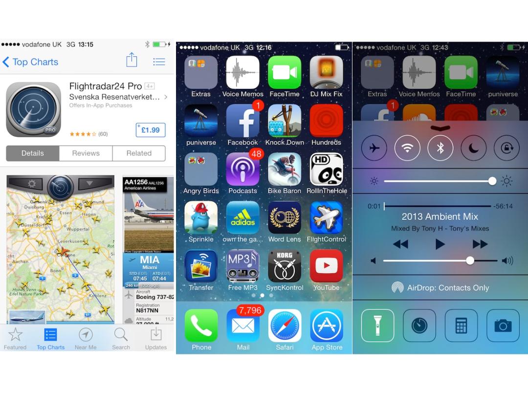
Control Center: Déjà vu
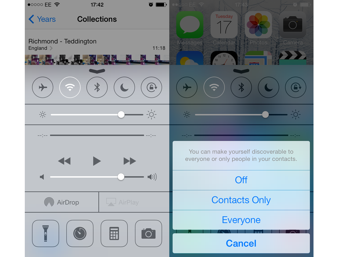
Apple knows a thing or two about protecting its own designs, but with iOS 7 it hasn’t been shy about pinching ideas from rival operating systems. Swiping up from the bottom of the screen brings up a very Android-esque settings panel named Control Center. With Android you’ll swipe down to get much the same thing.
Along the top of Control Center are toggle switches for Airplane mode, Wi-Fi, Bluetooth, Do Not Disturb and Orientation lock, with a brightness slider beneath that. Being able to change the brightness without going into the settings is a useful timesaver, albeit a timesaver that’s taken its sweet time making it to iOS.
Aside from its utility, what we like best about this mini menu is the way it appears as an opaque pane of frosted glass on top of whatever is displayed beneath, whether that’s the homescreen or an app that’s already running. Typical Apple panache.
But there’s more to it than a few toggles: there’s a miniature music player interface, controls for the new AirDrop wireless sharing feature, a one-button torch function (that removes the need for a dedicated torch app) plus shortcuts to the clock, calculator and camera apps. If you’re one of those people who always keeps the Settings icon pinned to the bottom of the homescreen, today is the day to remove it. The same features are present on the iPad iOS 7 update (except for AirDrop, which isn’t present on the iPad 3), and while it’s just as useful on the big screen, the layout isn’t quite as neat as on the iPhone.
Notifications and Search: Blurring the lines
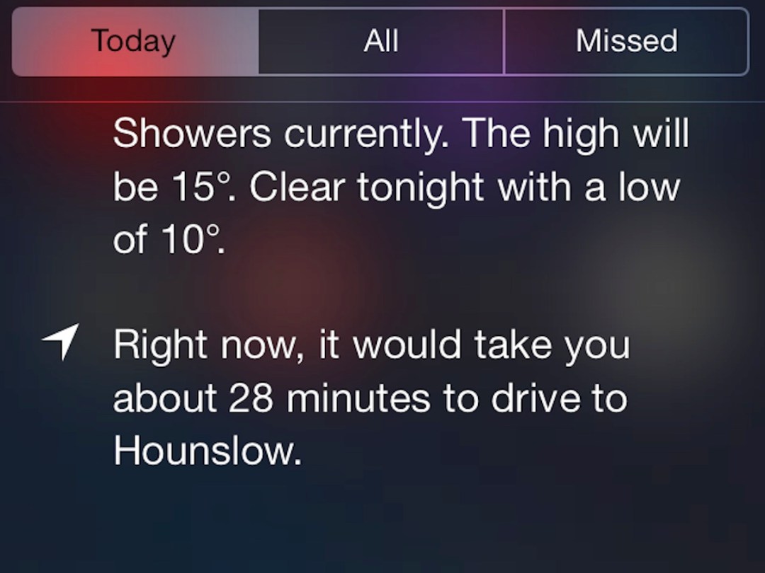
The Notification pull-down that appears from the top of the screen has been given a similar makeover, at least stylistically. It’s much the same in terms of what it displays, which you can specify in Settings, but the grey hessian is out in favour of coloured icons, bigger text and a blurry hint of the homescreen colours underneath. If you were hoping the Today pane was going to be a Google Now-rivalling selection of automatically gathered information that appears before you know you need it, you’re going to be disappointed, but it does get a little more useful and intelligent the more you use it, and we suspect this is just the start for the feature.
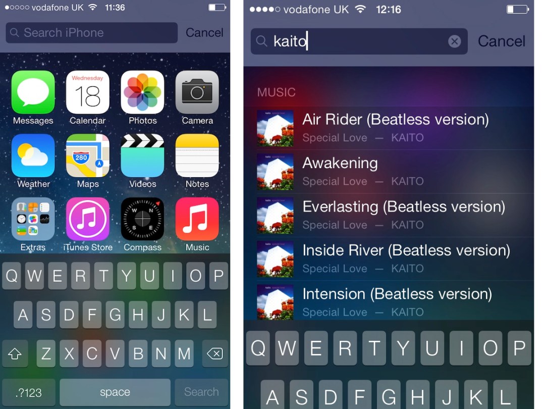
Another slight change is how the global search is accessed. Where once scrolling left from the leftmost homescreen page was your one-stop shop for searching your phone for apps, contacts and messages, now it’s done with a downward swipe from any homescreen page, with the search bar then perched above your apps. Give it a day or two and it becomes second nature.
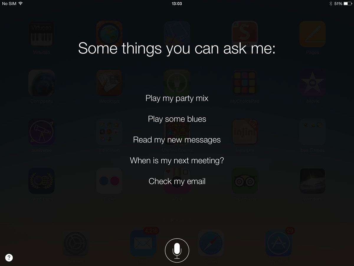
My week of bickering with Siri
Buttons: Clean. Clear?
The new design is without a doubt cleaner and more modern in its trappings than iOS 6, although it can be less obvious what’s what. For example, because the standard buttons and controls no longer have backgrounds and outlines, it’s not always clear if a white space or a bit of text is something to be tapped or not. At points, it feels as if usability has been ever so slightly compromised in the pursuit of design purity.
That minimalist approach goes a bit too far in places, too. In the Videos app, you’ll no longer see the names of your video files beneath their thumbnails. It’s a bit of an oversight, so we’re hopeful that it’s just a glitch that’ll be fixed in future.
Carry on Tweaking
Some of the design changes appear to have been made purely for the sake of change. If you tap on a folder of app icons, now you’re shown a maximum of nine apps at once and if you have more in that folder you’ll need to scroll across to the next group of nine. Or the next. This looks a bit smarter and less cluttered but it slows the process of finding and launching an app down a touch.
It’s a bit frustrating to see this sort of change being made when there’s more important work to be done, such as giving the user a simple and intelligent method of tidying up app icons automatically. As time goes by, apps are downloaded and apps are removed, which can leave you with a dozen partially populated homescreens. It’s a problem that’s been with us since day one, so it’s strange that nothing’s been done about it.
Why iOS 7 has made me want an iPhone in my life again
Multi-tasking: House Of Cards
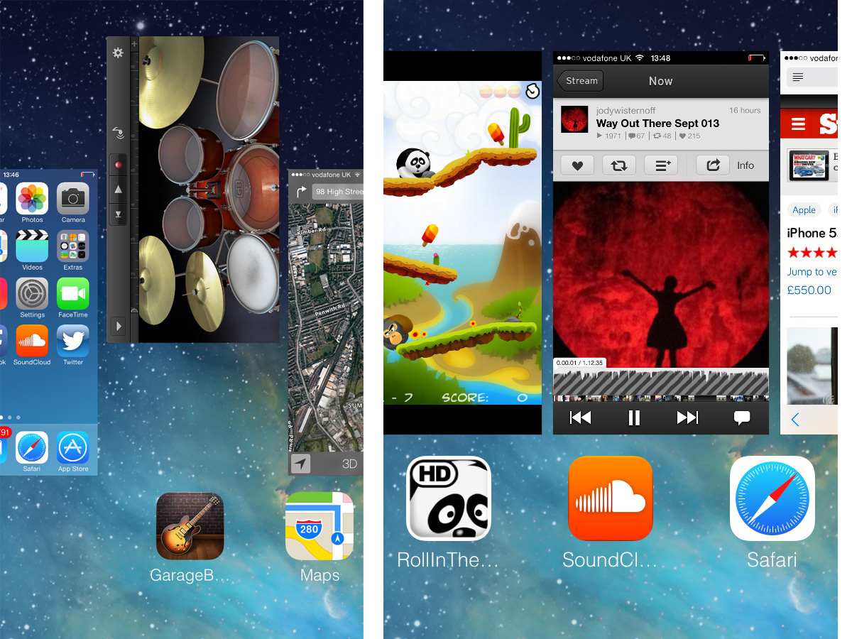
Another element borrowed from a rival OS is the new multi-tasking system, which owes a lot to the ill-fated BlackBerry PlayBook. Also seen in previous versions of HTC Sense, a double press of the Home button now displays a horizontally scrolling carousel of cards, each of which represents an app that’s currently running in the background, or one that has been recently. You can tap a card to re-enter that app or swipe it up to quit it.
Behind the scenes, iOS 7 has the ability to work more intelligently with apps in the background. For example, if an app has been updated to use the new scheduling feature, when it’s in the background it should only download extra content when other apps are taking a break and don’t need the resources. The main benefit of this should be increased battery life when multi-tasking.
The browser: full screen and fancy
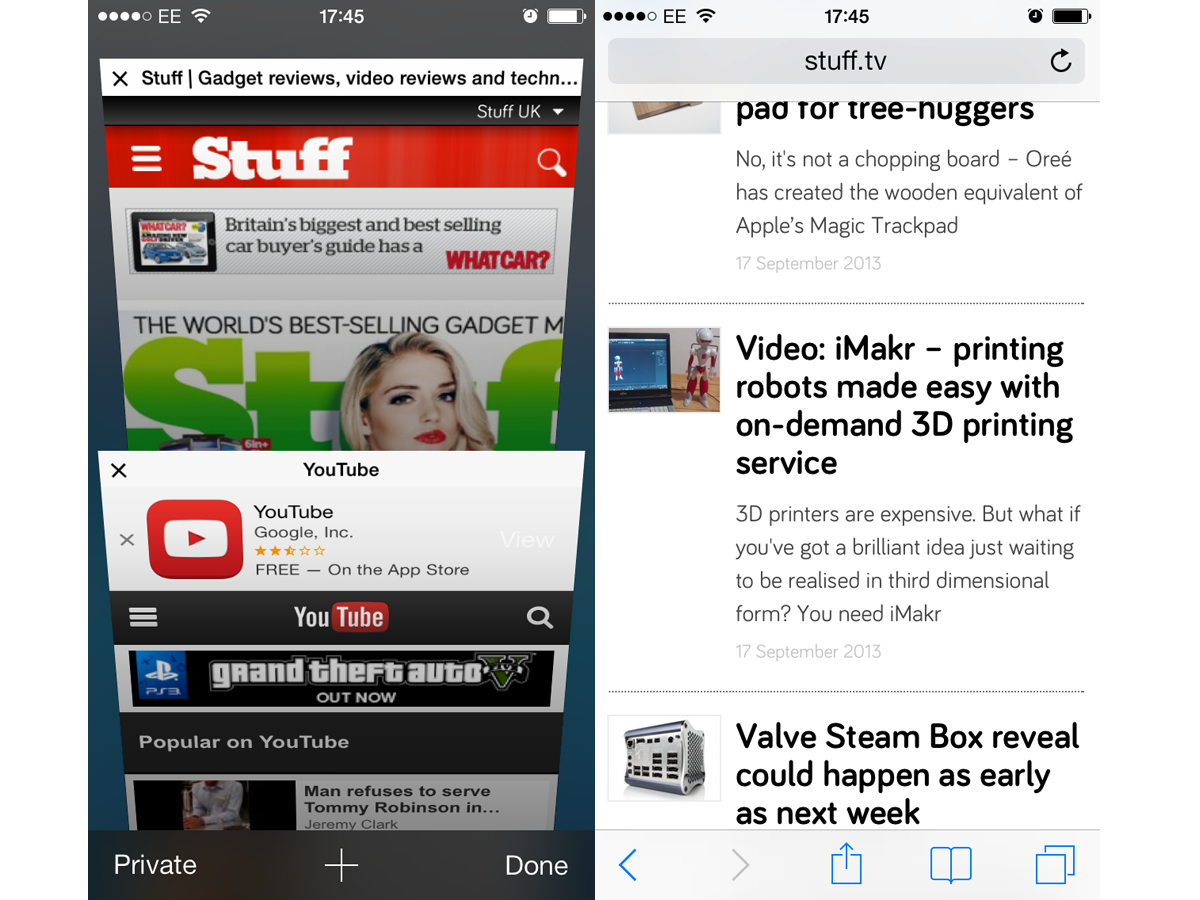
One big change is the built-in Safari web browser, which now has a frameless display on the iPhone, with controls for forward, back, sharing, bookmarks and new tabs popping up along the bottom of the screen when you scroll to the top or bottom of a page. That devotes more of the screen to the content you’re after but it can be a bit of a pain if you want to access those controls from the middle of a long page. That is, until you figure out that you can go back and forth by swiping horizontally from the edge of the screen – just like in Chrome.
You can also have a rummage through your recent history by bringing up the Tabs browser, which presents your previous web footprints in the form of a Rolodex-style carousel. Predictably, Flash remains unsupported, which leads to a few blank screens but YouTube works just fine via the browser or the official app.
AirDrop: no hook-up to Macs
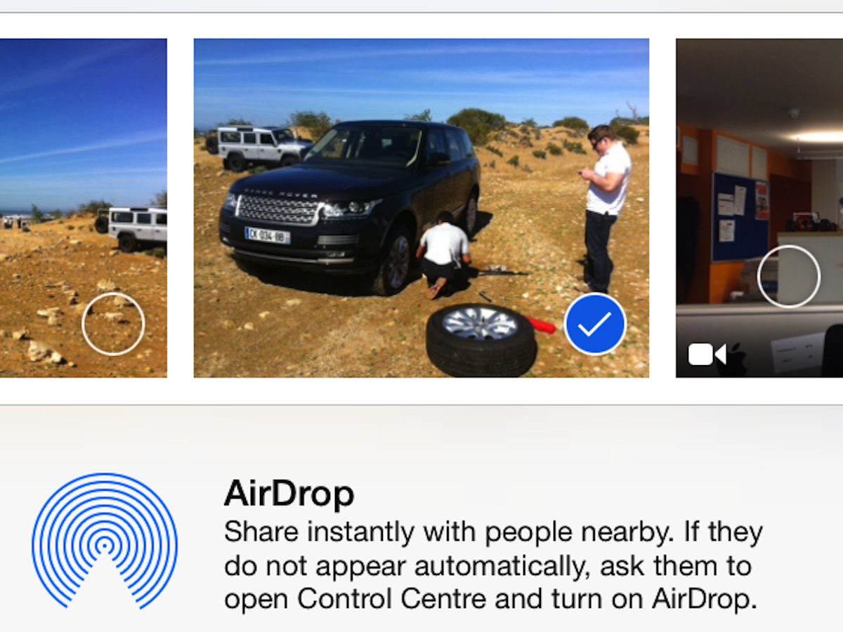
In terms of features, AirDrop is one of the biggest. It’s handy, but it’s also a bit half-baked. This Wi-Fi-based device-to-device file transfer system only works between certain iPhones, iPads and iPod Touches at the moment, not between iThings and Macs which is disappointing as it could have streamlined the process of offloading pics and video shot on your phone, or loading up your device with music and video from a Mac without connecting via iTunes.
AirDrop compatibility is limited to a small number of recent iThings (the iPhone 5, 5C and 5S, plus the iPad 4, iPad Mini and 5th-gen iPod Touch), which for now will grate with anyone who also has an iPad 3, iPhone 4S or older devices still in use around the home. That’s because it relies on modern Wi-Fi radios, so it’s never going to be backwards-compatible.
But despite our grumbles, in use AirDrop is quick and simple. It’s accessed as an additional option from the updated Share menu, which can be summoned whenever you find yourself dealing with compatible content, such as website URLs, map directions, pictures or video. You can set your phone or tablet to be discoverable by anyone nearby, only those in your contacts book or turn it off completely. Once someone has accepted your invitation to share, transfer is speedy and painless and the files can then be opened in the relevant app or saved to Photos. It’s a neat way to swap pictures and links between phones but it does feel like a bit of a letdown without integration with AirDrop on a Mac.
Camera and Photos: so much more than Instagram Lite
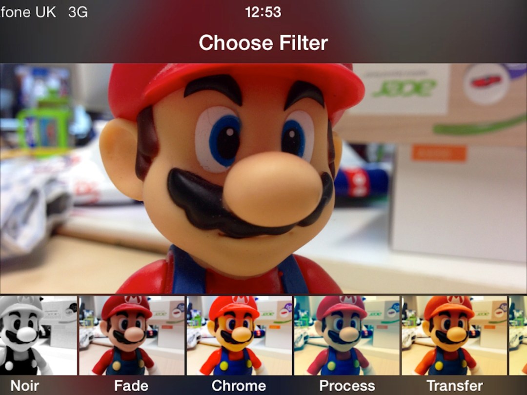
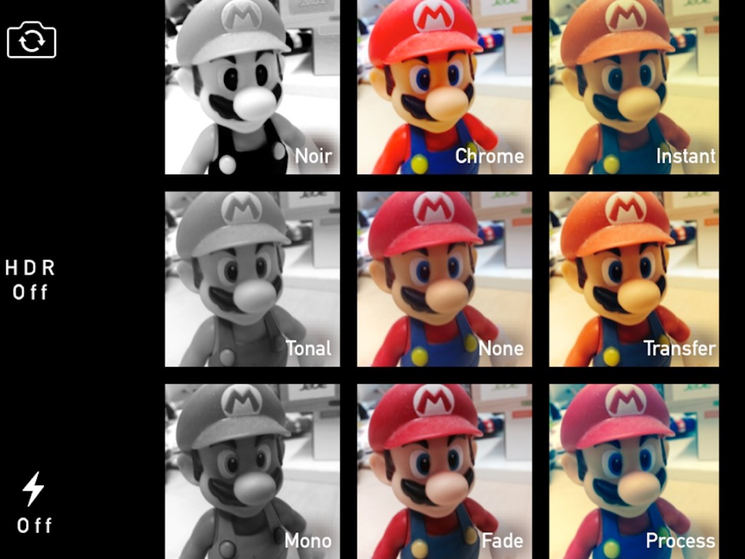

The camera app is good. Really good. So good, it’ll feel like it’s giving your old phone a new lease of life. Swapping between modes is done with the flick of a finger across the screen, and there’s now a sort of “Instagram Lite” built in. Depending on which device you’re running iOS 7 on, you can add retro colour filters during and/or after shooting stills, and there are also options for correcting red eye, cropping and auto colour correction. Square format and panoramic stills are thrown in (again, on selected devices), and for the iPhone 5S there’s a fantastically fun and easy-to-use 120fps slow-mo video mode.
Once you’ve taken your pics you can enjoy the new Photos browser, which arranges your shots into groups called “Moments”, “Collections” and “Years”, rather than the single chronologically ordered stream of the old style Camera Roll with the option to create your own albums as before. The Share option has been tidied up, with distinct rows for AirDrop, social media sharing and messaging, and another for AirPlay, AirPrint and other options. You also get the chance to add more pictures or video directly from the Share page without having to go back to the main Camera Roll – a nice touch. In fact, there are similar nips and tucks all over iOS 7 which aren’t big news in themselves but all contribute to the fresher, more modern feel.
The App Store: the long-awaited automatic updating

Any newly purchased iOS 7 device now gets free access to some of Apple’s own apps, such as iMovie (for video editing), iPhoto (for photo editing), Pages (for word processing), Numbers (for spreadsheeting) and Keynote (for presenting), but not GarageBand. These are all superb apps that go a long way to showing off the potential of the iPhone and iPad. Android still has nothing comparable.
The App Store interface has been given a light makeover and the first time you access it you’ll be prompted to turn on automatic updating of apps (finally, it’s here!). We suggest you do so to avoid storing up a backlog of apps that need updating – it’s always been one of our least favourite sights in iOS. From our experience thusfar, the updating works seamlessly.
Verdict: still no widgets, this is iOS, just prettier and more capable
If you’ve been feeling apprehensive about the iOS update, don’t fret. It may be sexier but this is essentially the simple, downright efficient mobile OS we’ve all been used to and the reason iDevices started selling in their wagonloads in the first place.
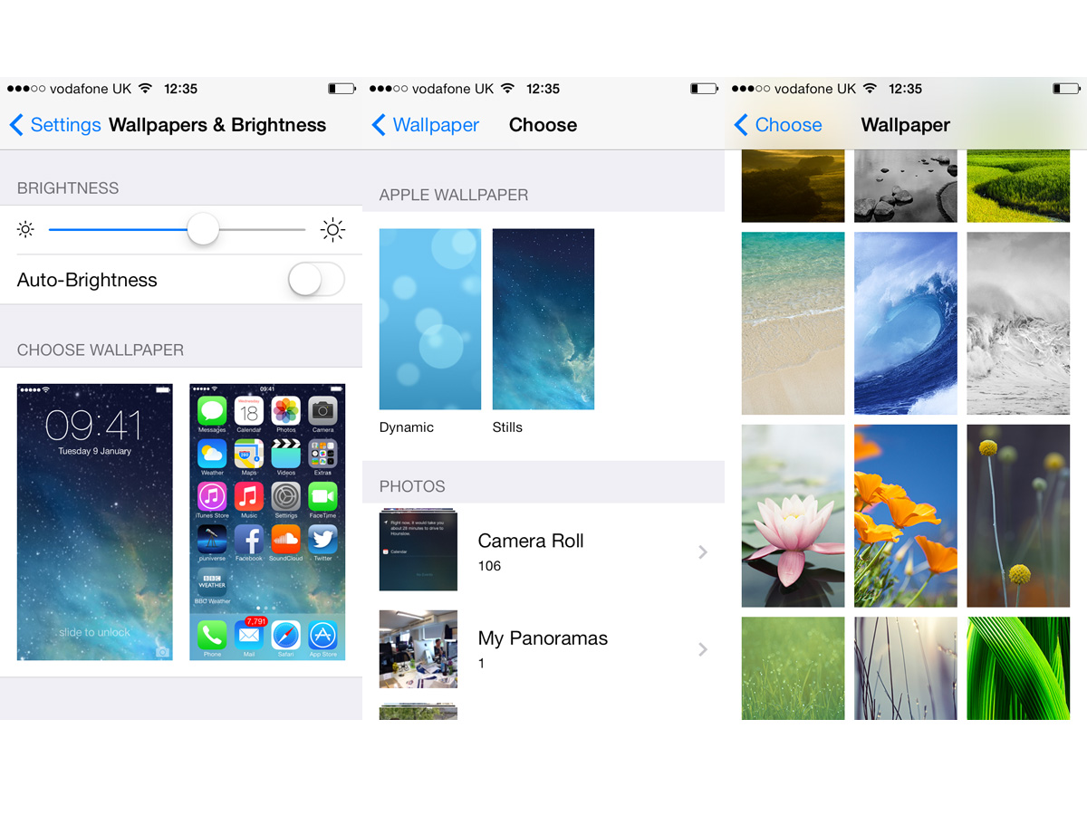
That does mean no widgets or Live Tiles – the notifications pull-down is the closest you’ve got – and very little customisation. Sure, you can change the wallpaper on the home and lockscreen to tone down the initial shock of iOS 7’s colour scheme but plenty of stalwarts stay pretty much the same – like the excellent and eerily accurate keyboard.
By refusing to add a top layer of social media feeds, news tickers and weather forecasts, Apple has kept the focus on apps, which it clearly recognises as one of the major selling points of iThings over Android rivals. A more sparky, widget-based front end would most likely have pushed these gems into the wings, and that’s something we’d hate to see happen. However, if 90% of your phone and tablet use is based around Facebook, Twitter, music, video and the web, it’s unlikely that this latest edition of iOS is going to light your fire.
As a family oriented OS it’s still unbeatable, and remains a far safer, less vulnerable environment than the more liberal but less disciplined wolrd of Android.
It’s no longer a question of which is the best OS, it’s a matter of which is the best for you. If awesome apps, a slick interface and a sense of security are top of your list, iOS7 is a clear winner. If you prefer to do things your way, the customisability of Android Jelly Bean can’t be beaten, thanks to its wide range of widgets, launchers and lockscreens. iOS 7 gives you just one option but it’s an OS that’s as beautifully crafted and worthy of gadget pride as iPhone and iPad hardware itself.
Words: Tony Horgan and Sophie Charara
iOS 7.1 [update 12/03/14]
![iOS 7.1 [update 12/03/14]](https://www.stuff.tv/wp-content/uploads/sites/2/2021/08/apple-ios-7.1-review-main-001-1.jpg)
We liked iOS 7. It wasn’t the complete reinvention we’d hoped for but it gave the iPhone and iPad a much-needed spring clean. Now iOS 7.1 is available, which introduces an all-new CarPlay feature along with minor tweaks and fixes to Siri, the iPhone 5s camera app, fingerprint recognition, the Calendar app and an overall speed increase for iPhone 4 users.
iOS 7.1 – CARPLAY
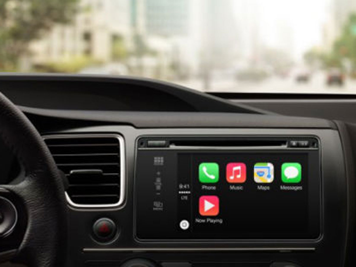
Probably the biggest single change is the introduction of Apple CarPlay, which enables those of us taking delivery of a new Ferrari, Honda, Hyundai, Mercedes or Volvo to look forward to a new level of integration between our iPhones and in-car media systems.
Apple CarPlay allows users to connect their iPhone to their car, upon which the car’s own display takes its feed from the phone. The car’s touchscreen or hardware controls – such as knobs, dials and buttons in the central column or steering wheel – can be used to control certain compatible apps running on the iPhone. For instance, Siri can be summoned and ordered, music can be selected and played, and if you see fit to replace your existing in-car sat-nav with Apple’s own Maps app, that can be done too.
Right now that’s not something that will impact greatly on the lives of the masses, but it’s an important investment in the future. Many of the world’s major car brands are set to include CarPlay functionality further down the line, although it’s interesting to note that, at this point, the list which includes Ford, BMW and Toyota makes no mention of the VW Group (which encompases Audi, Seat and Skoda).v
iOS 7.1 – Siri
We’ve never been that keen on Siri. Its speech recognition can be hopeless, and its insistence on making wild guesses as to your utterances and then phoning random numbers from your contacts without checking with you first is infuriating. iOS 7.1 attempts to improve matters by giving you the option of telling Siri when to stop listening.
The idea is that you release the Home button when you’ve said your piece, but in our tests so far it hasn’t improved the situation by any notable degree. Those complete communication failures are still in evidence.
iOS 7.1 – Performance
The original iOS 7 update resulted wasn’t always good news for older devices, with the iPhone 4, 1st-gen iPad Mini and iPads from 3rd-gen backwards all suffering a loss of smoothness when switching orientations and even some lag during simple operations.
We’ve now updated an iPhone 4, 1st-gen iPad Mini and 3rd-gen iPad, and they all benefit from improved response times and smoother animations on the home screen. The iPhone 4 still shows a small amount of lag, but there’s a big improvement, particularly, when opening folders containing groups of apps.
There’s not a whole lot else that’s changed from iOS 7. The “Slide to unlock” text now has a shinier highlight and there seems to be a little more fluidity to the parallax wallpaper animation as you tilt your device. If you have an iPhone 5 you can set the camera to automatically switch to High Dynamic Range mode when it thinks the situation demands it (for more even exposures of high contrast or low-light scenes), the Calendar app has had a little make over and the fingerprint recognition has been improved.
So overall, while iOS 7.1 isn’t a huge update, it does fix a few things, particularly for users of older iDevices. We can’t see any reason not to upgrade.
Stuff Says…
Fresh faced and fluoro, there’s no radical shift here but iOS 7 wins on function as much as (virtual) form
Good Stuff
Squeaky clean, modern look
Automatic app updating
Control Center brings all-important functionality
Bad Stuff
If you were holding out for widgets, you’ll be disappointed
No AirDrop compatibility with Macs
Some transitions seem a bit slow
 Tony Horgan
Senior Reviewer
Tony Horgan
Senior Reviewer